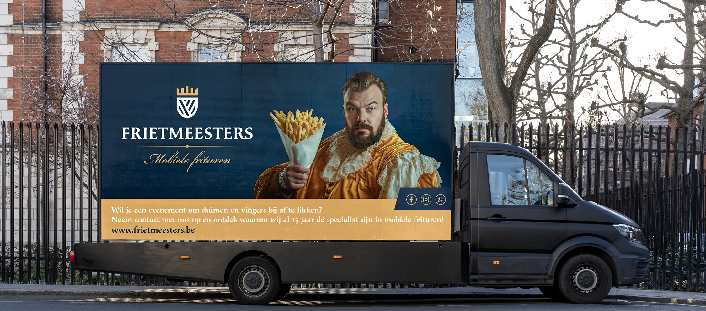
Frietmeesters
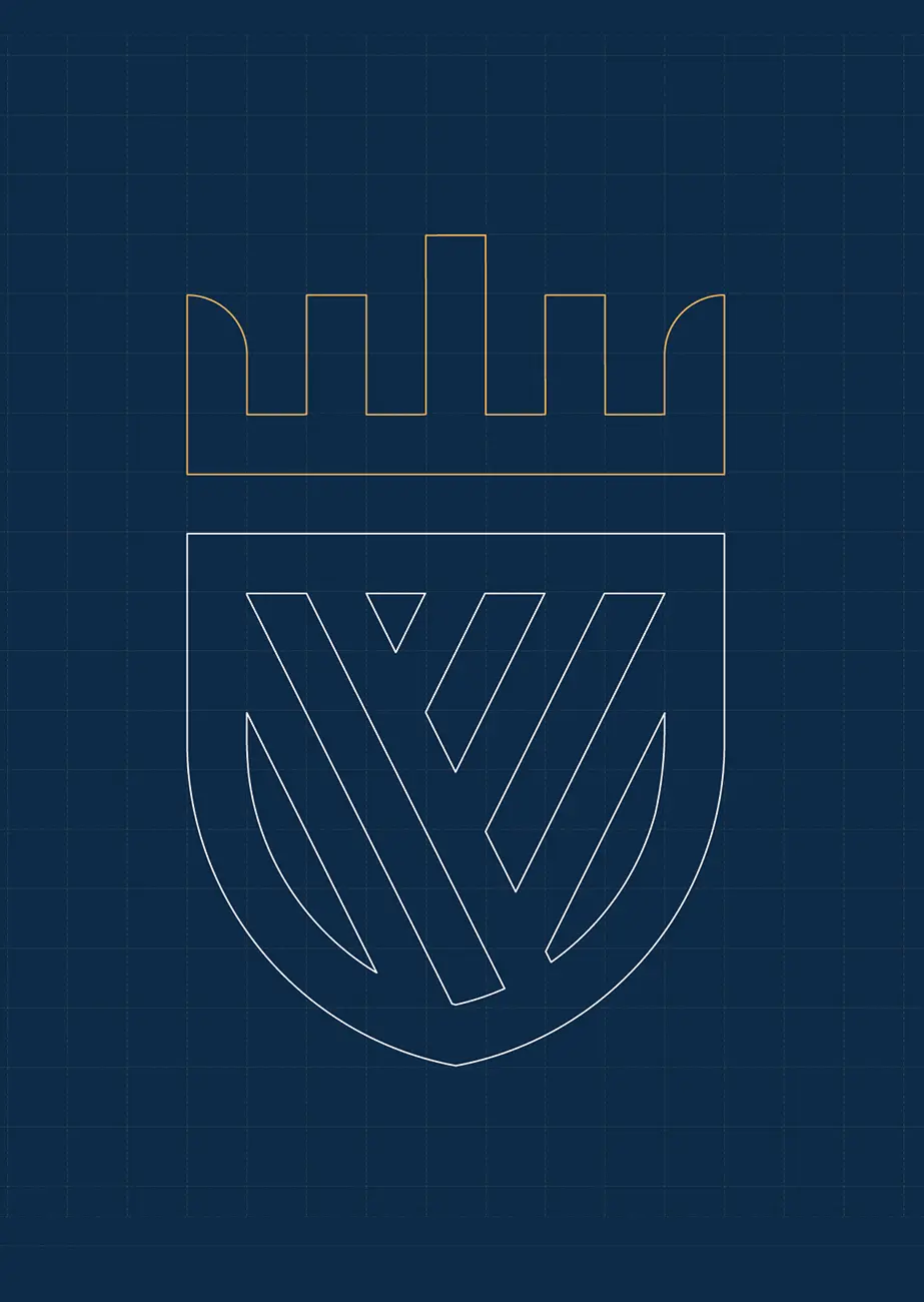
Frietmeesters serves more than just golden chips; it is an experience. We gave their brand a new, contemporary look with a powerful logo and a recognisable house style that perfectly matches their traditional quality and fresh approach.
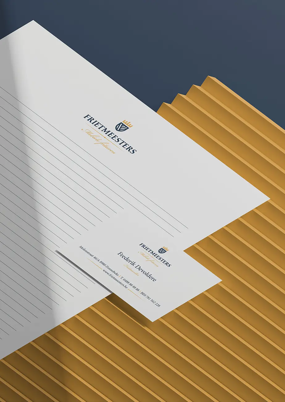
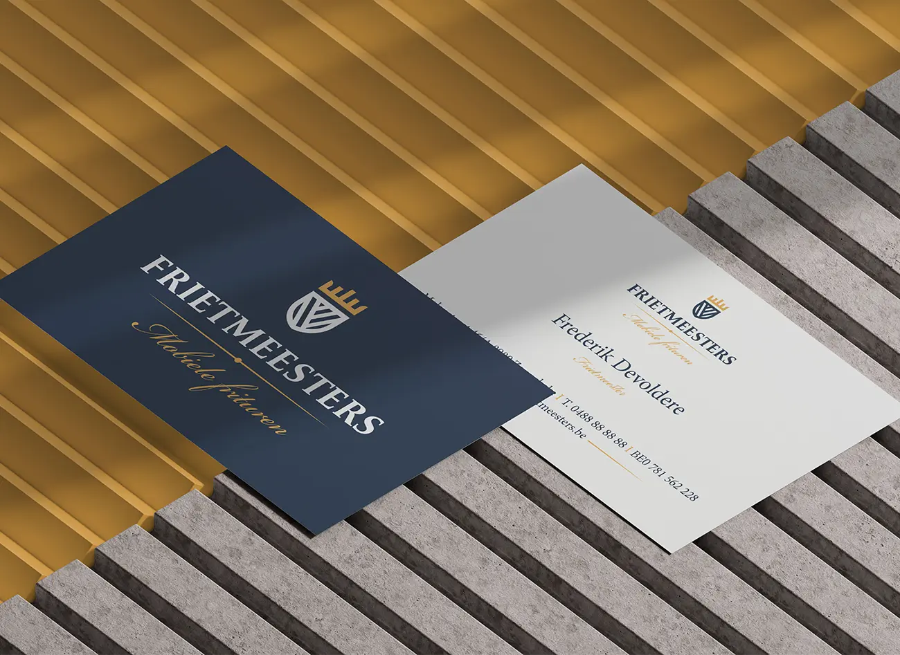
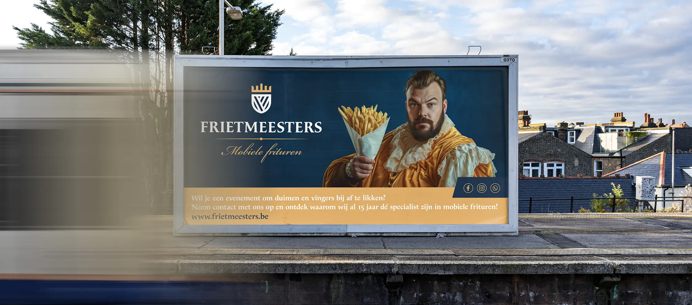
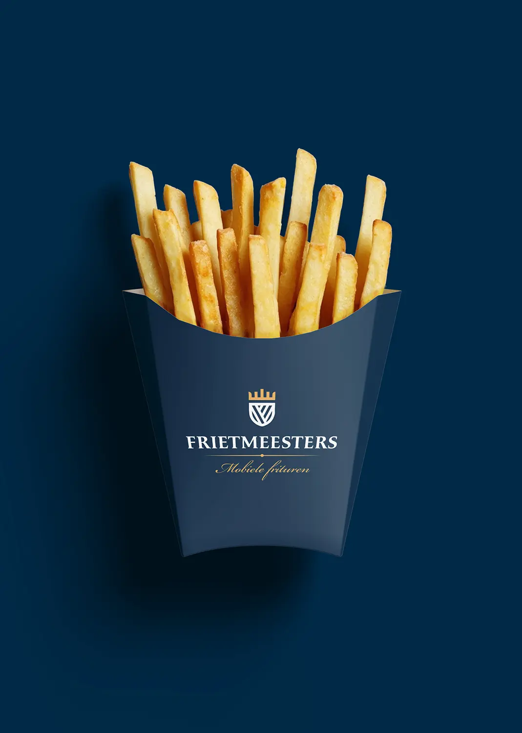
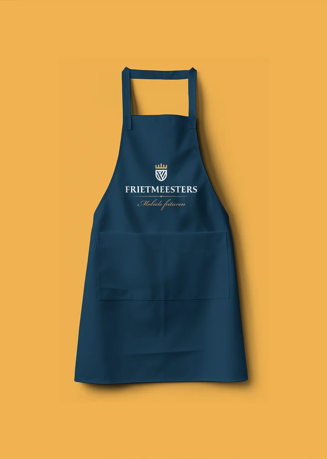
We incorporated the new visual style into designs for packaging, menus, work clothing and facade signage. Now everything is ready for production and forms a strong and tasteful brand image that leaves a lasting impression, just like the chips.
Diensten
- Logo design, Brand design, Visual identity
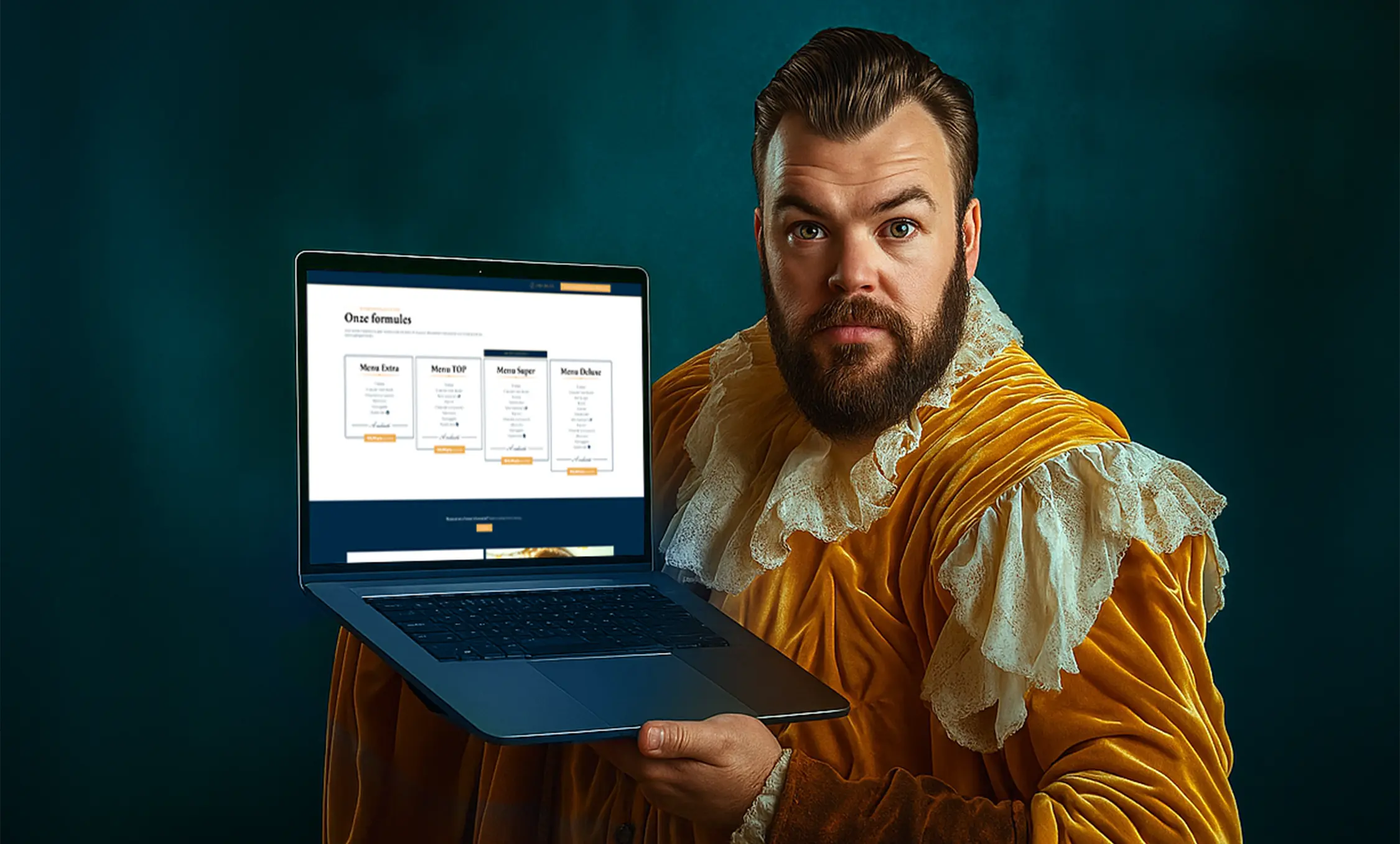
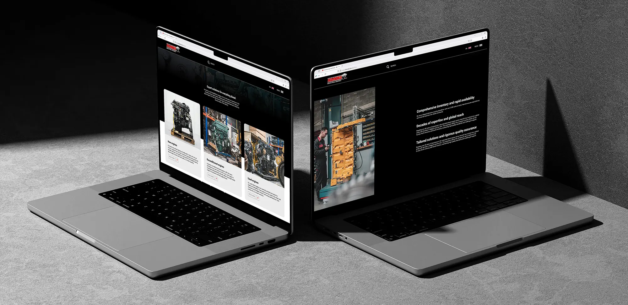
- Web development
Live website
www.frietmeesters.be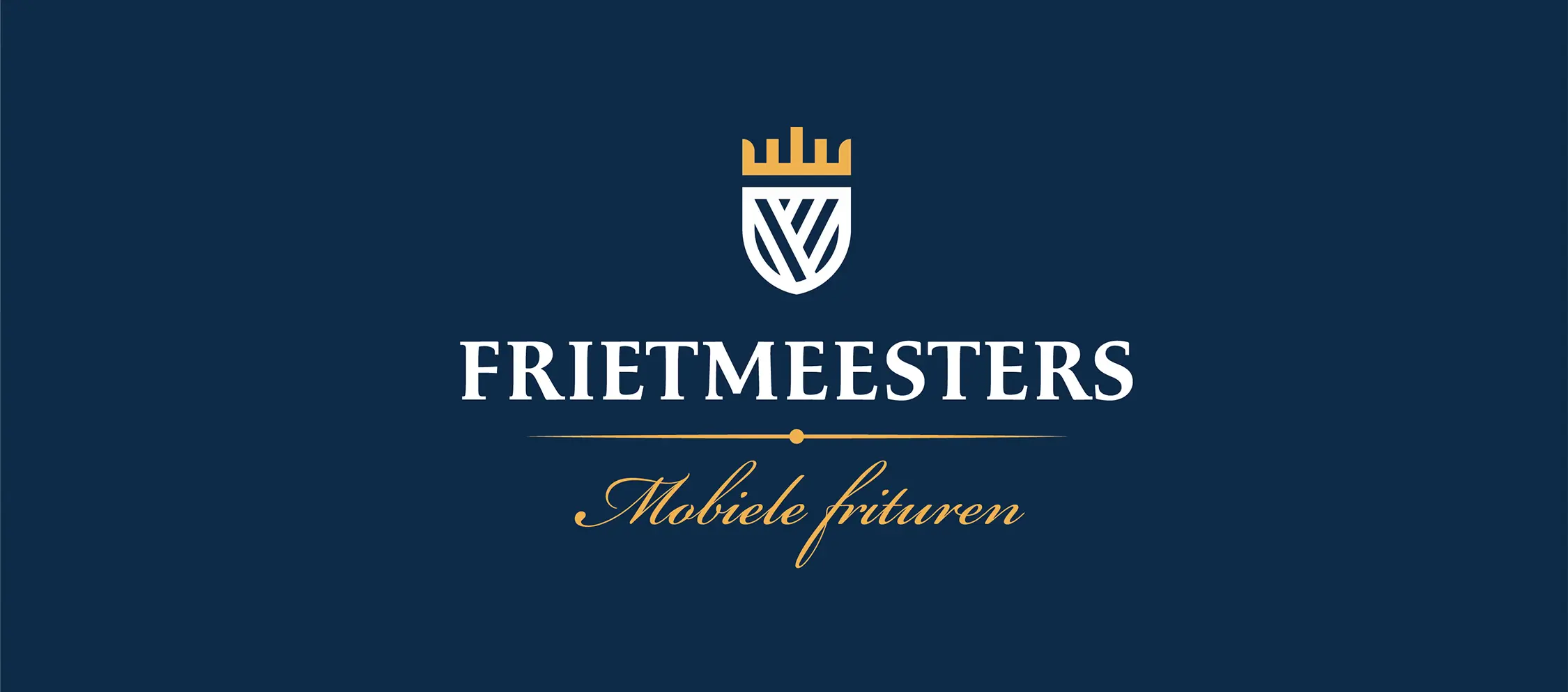
Maximum Yellow Red
Oxford Blue
Frietmeesters' new house style exudes expertise and tradition, with a colour palette as rich as their flavours. Oxford Blue and Maximum Yellow Red create a stylish and recognisable contrast that radiates confidence and quality. The overall feel is premium, without being detached.
Frietmeesters' new house style exudes expertise and tradition, with a colour palette as rich as their flavours. Oxford Blue and Maximum Yellow Red create a stylish and recognisable contrast that radiates confidence and quality. The overall feel is premium, without being detached.
Al ruim 15 jaar maker van goudgele meesterwerken.
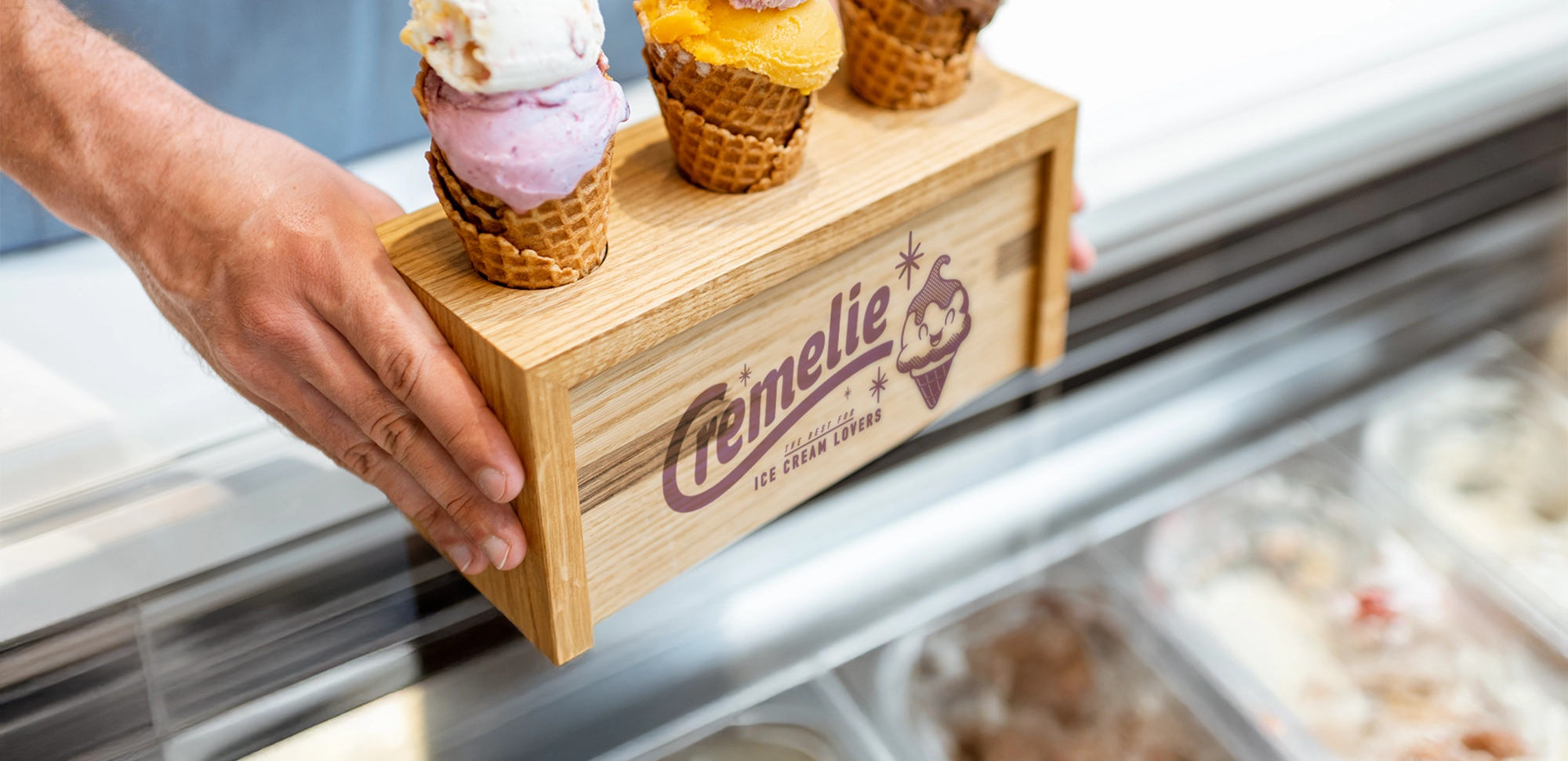
Frietmeesters' digital and physical media bring the brand to life. From the website to the billboard and packaging: every application exudes the same recognisable class.
Frietmeesters' digital and physical media bring the brand to life. From the website to the billboard and packaging: every application exudes the same recognisable class.
More cases
See next case
Let's connect
Get in touch
We are ready to listen to your ideas, challenges and plans. Get in touch and discover what we can build together.
Contact us